1898 Sans
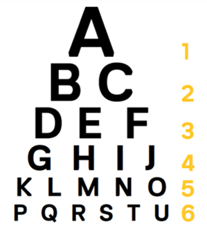
1898 Sans is a custom font that was created specifically for Weill Cornell Medicine. It is both modern and friendly and should be used confidently: big and bold. The name is homage to the year our medical school was founded.
We never use ALL CAPITALS.

Arial
Our secondary font is Arial, and can be used in any applications. It works well for small text or long body copy.
*Our font packages are intentionally limited to a small set of options to maintain consistency in our brand identity and strengthen recognition and recall.
Our typeface is one of the key drivers of our visual identity and should be used to reinforce our brand story.
In general, 1898 Sans Bold is used more consistently than Regular and Light, but it should also not dominate. When choosing a weight, always consider the key message, context, and ultimate takeaway.
Digital
In digital applications we use 1898 Sans Bold and Regular for headlines and subheads only at sizes larger than 15pt. We never use 1898 Sans Light in digital applications.
Use Open Sans for all online digital applications for any text sizes smaller than 15pt.
When sharing editable files electronically, use a font that is commonly found on all computers, such as Arial. If you choose to use 1898 Sans in any digital document, please ensure that the document is delivered only as a PDF file so no changes can be made and no fonts will be changed. 1898 Sans should not be used for any editable documents.

