
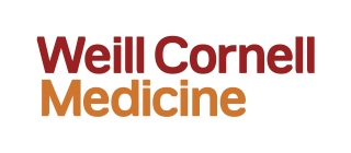
Wordmark
Our identity is driven by our wordmark and tells a story of collective power and individual focus. As an organization we are a body of discrete disciplines – across caring, discovering, and teaching – that come together to solve problems and see solutions from multiple perspectives.
Our wordmark is a reflection of the unique characteristics that each of these disciplines brings: Its soft edges are approachable, its beveled forms are distinct, and its combination of red and orange convey an upbeat, positive attitude.
Our wordmark also has a dynamic, flexible configuration that can be used in 1-, 2-, or 3-line forms.
The wordmark must be present in all materials.
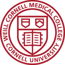
Seal
History
Cornell University celebrated its first inauguration on Oct. 7, 1868. At the ceremony, New York Lt. Gov. Stewart L. Woodford administered the oath of office to President Andrew Dickson White and presented him with the university charter, Seal and keys. For all of Cornell’s early inaugurations, the charter and Seal represented the symbols of office.
Cornell Medical College was founded in 1898, and the original Cornell University Seal was modified to incorporate the college’s name. The Seal was updated again in 1998 to reflect the name change to Weill Cornell Medical College.
Today
The Seal remains a critical and differentiating component of our new identity as a supportive visual device, signifying our academic prestige and reflecting the institution’s history and connection to parent Cornell University. While our name is evolving to Weill Cornell Medicine to encompass the research and patient care missions of the organization, the text within the Seal will continue to reflect the legacy and importance of our educational mission.
The Graduate School of Medical Sciences Seal will still be utilized in the school’s logo lock-up, and in all corresponding materials.
The Seal must be present in all materials and cannot be used alone or isolated within itself.

Active Relationship
Flexible Space / Print
In brand communications the relationship between the Seal and our wordmark is flexible. The two elements retain a vertical alignment, but the space between each is variable. Opening up the relationship between the Seal and our wordmark creates a frame for content and enables page layouts to feel alive and active.
· When the Seal is in color, the wordmark must be in color.
· When the Seal is white, the wordmark must be white.
· When the Seal is black, the wordmark must be black.
· When the Seal is detached from the wordmark, its diameter should match the height of the two-line wordmark.
· The Seal’s diameter should match the height of the two-line wordmark when detached.
Flexible Space / Digital
In digital applications – such as websites and banner ads or applications with limited vertical space, it is permissible to use the Seal and our wordmark in a flexible horizontal configuration.
· Minimum clear space in horizontal flexible configurations = 400 pixels.
Graphic Seal
The Seal can also be used in isolation: detached and magnified, either as an oversized graphic or “watermark” element in instances such as building flags where it’s important to signify heritage.
When the Seal is cropped, please only bleed right, and ensure the “M” and the “U” of “MEDICAL” and “UNIVERSITY” are visible as well as “WEILL CORNELL” and “CORNELL.”