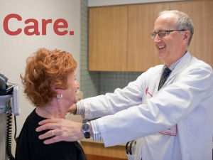
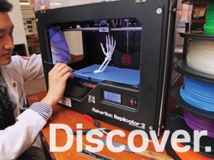
Our photography represents the human interactions at Weill Cornell Medicine every day. They are honest and genuine, and capture real life stories from multiple perspectives.
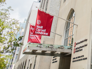
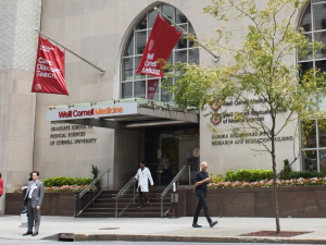
Images should be focused on people rather than buildings, to continue reinforcing the message of patients at the center of everything we do.
Buildings can be used when featuring a specific location or to promote facilities.
Remember to obtain use permissions from photographers as well as from people in the images.
In the Conversation

These photographs capture “real-time” conversations between patients, doctors, teachers, and students. They should feel genuine, not staged with each other. Viewers should feel as if they are in the conversation.
Portrait

These photographs put humanity front and center, drawing a connection between people and care. Portraits should feel approachable and positive with a very slight smile. Tight cropping is used to add impact. We encourage this style for portraits whenever possible.
Observation

These photographs capture a window into the world of patient care and provide a fly on the wall point-of-view of human interactions. Images should feel real, not staged, as if looking into a live situation.
Faculty Photos
WCM faculty members are the human ambassadors of our brand. These photographs should feel natural, warm and approachable, and aim to capture a genuine moment.
- Honest: Portrait shots should feel real and genuine.
- Confident: Subjects should look confident but approachable.
- Bright: Backgrounds should be clean, light and airy, and the focus should be on the subject.
Color Frames
Color frames highlight a moment of human connection and create a focal point. They also add a layer of optimistic energy.
Color frames only use colors from our color palette. Place color field over image and apply a “multiply” effect. Frame corners are not sharp, they are slightly rounded to echo the rounded corners of our typeface.
- Illustrate a connection
- Create a focal point
- Color overlay
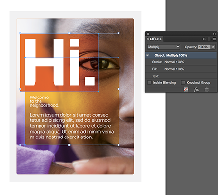
Designer Tip:
The overlay is created by selecting Multiply in the “Effects" tool module in InDesign.
The overlay/multiply effect is set to 100%. This setting works best when used with orange and yellow.

