The heritage of the Weill Cornell Medicine color palette is represented by Cornell University Red, which symbolizes the strength and foundation of our brand. The Orange brings our promise to life and simply symbolizes the positive results we strive for every day.
Primary
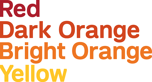
Our brand uses color the same way we use typography: confidently, boldly, and powerfully. Cornell University Red is a constant and must appear on all communications. When there is only one color present, it must be Cornell University red. Dark Orange and Bright Orange can be used to “light up” content and design. Yellow should be used more sparingly.
Our color palette is intentionally limited to a specific set of warm primary colors and neutral secondary colors. It makes us more instantly recognizable, standing out in a highly competitive healthcare environment.
CMYK files are made up of Cyan, Magenta, Yellow and Black ink. CMYK colors appear best in printed materials.
RGB files are made up of Red, Green and Blue light, and appear best in digital files.
Secondary
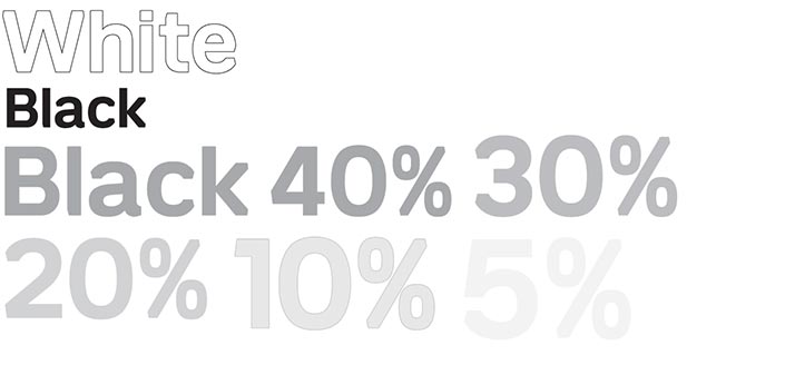
Our secondary palette is used in support of our primary palette and comprises a range of gray tones. The darker the tone, the more sparingly it’s used. Black and white are used for punctuation.
Note: 5% Black is for print applications only.